The chart components from the Flowbite Library are open-source under the MIT license and they are styled with the utility classes from Tailwind CSS and based on the open-source ApexCharts library.
We provide an extensive collection responsive chart types such as area, bar, column, pie, and radial that can help you visualize complex data inside graphs for your users in admin dashboard layouts and more.
You can also easily customize the colors, sizes, and options of these charts either via Tailwind CSS directly or via the JavaScript options from the ApexCharts library. Dark mode is also supported by default.
Getting started
Before continuing make sure that you have Tailwind CSS, Flowbite and ApexCharts installed in your project.
Follow the quickstart guide from Flowbite to install the plugin styles and functionality
Set charts to true within the Flowbite Plugin options from the Tailwind CSS configuration file:
plugins: [
  require('flowbite/plugin')({
      charts: true,
  }),
  // ... other plugins
]
- Make sure that you have ApexCharts installed and configured in your project:
Install ApexChart via NPM and save it in your package.json file:
npm install apexcharts --save
Alternatively, you can also just include the CDN link:
<script src="https://cdn.jsdelivr.net/npm/apexcharts"></script>
Now that you have all the libraries installed you can copy-paste the chart examples below in your code.
Area chart
Use this example to show a basic area chart by setting the type: "area" option in JavaScript:
Line chart
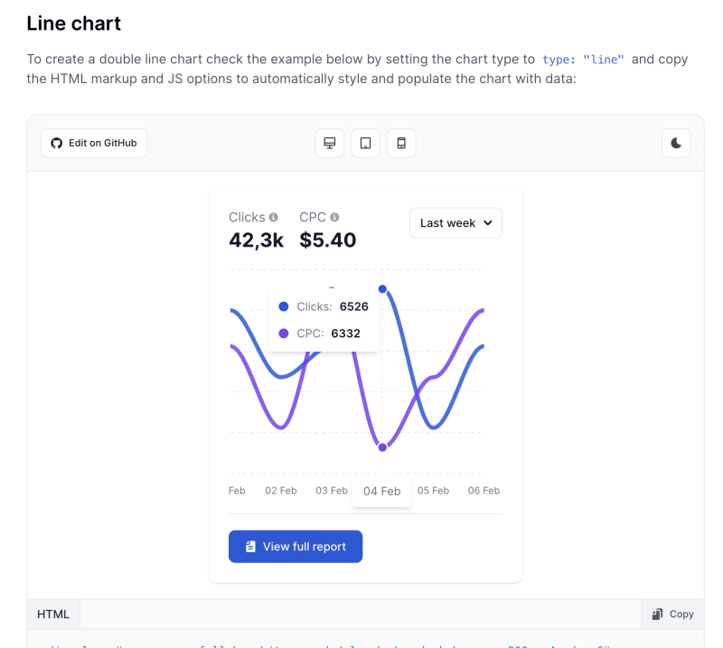
To create a double line chart check the example below by setting the chart type to type: "line" and copy the HTML markup and JS options to automatically style and populate the chart with data:
Column chart
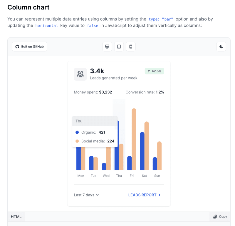
You can represent multiple data entries using columns by setting the type: "bar" option and also by updating the horizontal key value to false in JavaScript to adjust them vertically as columns:
Bar chart
Create a horizontal bar chart with as many data series as you like by setting the type: "bar" chart type via JavaScript and copy the example below into your project. You can enable or disable the labels on the X or Y axis by setting show to false for the xaxis and yaxis objects of the chart options.
Pie chart
Create a pie chart with multiple data series by setting the type: "pie" chart type option via JavaScript and copy the following HTML markup code and options from below:
Donut chart
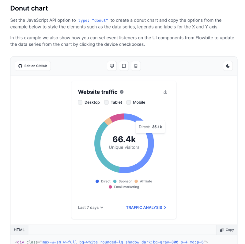
Set the JavaScript API option to type: "donut" to create a donut chart and copy the options from the example below to style the elements such as the data series, legends and labels for the X and Y axis.
In this example we also show how you can set event listeners on the UI components from Flowbite to update the data series from the chart by clicking the device checkboxes.
Radial chart
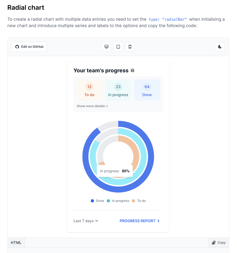
To create a radial chart with multiple data entries you need to set the type: "radialBar" when initialising a new chart and introduce multiple series and labels to the options and copy the following code:
Options
Learn more about how you can customize the charts including the data, labels, legend indicators, size and appearance of the graphs, and other options by checking out the examples below.
Data series
You can add multiple data sets by using the series object and setting a name, array of data and custom color of choice. In this example we added two data series based on a blue and purple color.
Labels
Show labels for the X and Y axis by enabling the xaxis: {show: true} and yaxis: {show: true} and customize the appearance of the labels by adding Tailwind CSS utility classes to the cssClass object based on the following example:
Legends
Automatically show the legend indicators of the chart by setting the legend: { show: true } value when configuring the options via JavaScript. You can also set position of the legend by using the position: {x} option inside the legend object to place it to the top or bottom side of the chart.
Tooltip
Enable the tooltip that is shown when hovering over a data set by setting {tooltip: {enabled: true}} and customize the tooltip component via the following options:
-
x: {show: false}will show or hide the X axis data y: {show: true}will show or hide the Y axis data
Grid
Add a grid layout of dashed lines to improve the readability of the data entries for the charts by configuring the {grid: { show: true }} object and customize the appearance via the strokeDashArray object.
Data labels
Show data points on the chart by enable the dataLabels: {enabled: true} object when configuring the options via JavaScript and customize the appearance based on the following example:
Chart size
You can set the size (width and height) of the chart by passing the width: {size} and height: {size} options via JavaScript to the chart object using pixels or percentages:
JavaScript behaviour
With the charts from Flowbite and through the API of ApexCharts you can programatically configure and handle the behaviour of the components by using the methods directly on the chart object.
For example, here's how you can initialize a new chart with an options object and call the render() function:
var chart = new ApexCharts(el, options);
chart.render();
You can also update the options or data on demand. Here's an example how you can add or remove data:
var chart = new ApexCharts(el, options);

chart.updateSeries([{
  data: [342, 442, 311, 421, 212]
}]);
You can also toggle the visibility of a data series by calling the toggleSeries() method:
var chart = new ApexCharts(el, {
  series: [{
    name: 'Developer Edition'
    data: [342, 442, 311, 421, 212]
  }, {
    name: 'Designer Edition'
    data: [342, 442, 311, 421, 212]
  }]
});

chart.toggleSeries('Designer Edition');
You can read more about all of the methods by checking out the official ApexCharts documentation.
Credits
Check out the full collection of Tailwind CSS Charts on Flowbite with live examples, code and documentation.
More examples
Check out more chart examples built with Flowbite, Tailwind CSS and Flowbite with these resources:


Top comments (1)
I will be using this. It's really good.