
Introduction
Expertise in CSS and the ability to implement the necessary UI components for a business is an important skill for a Frontend developer, which sets you apart as a candidate for your dream job. This article covers 41 questions in a 'question: answer' format that I encountered during Frontend Developer job interviews.
This article is the second part of a series on interview questions for frontend developers. If you haven't read the article on JavaScript interview questions yet, I recommend checking it out using the provided link - 52 Frontend Interview Questions - JavaScript
1. What are the values of the display property and how do they work?
The CSS property "display" determines how a specific HTML element should be displayed.
-
display: none- The simplest value. The element is not displayed at all. -
display: block- Block elements are stacked vertically, one on top of the other. The block tries to expand to the full available width. -
display: inline- Elements are placed on the same line, sequentially. The width and height of the element are determined by its content and cannot be manually changed. -
display: inline-block- The element is inline, but its width and height can be changed. -
display: flex- flexbox usage. Recommend to check out the links. -
display: grid- grid usage. Recommend to check out the links as well.
There are other values, but they are rarely used.
Learn more
Learn more
And even more
2. What is flexbox?
Flexbox is a layout module that provides a flexible way to arrange and align elements within a container. It allows for easy manipulation of the size, position, and spacing of elements, making it ideal for creating responsive and dynamic layouts. With flexbox, you can easily create complex and multi-directional layouts without relying on floats or positioning hacks. It provides a powerful set of properties and values that enable you to control the flow and alignment of elements within a container.
3. What is grid?
Grid is a layout system that allows you to create complex, grid-based designs for web pages. CSS Grid Layout provides a two-dimensional grid structure, where you can define rows and columns to position and align elements within the grid.
With Grid, you can divide your webpage into a grid of cells, specifying the size and alignment of each cell. This allows for precise control over the placement and arrangement of elements, making it easier to create responsive and flexible layouts.
Key features of CSS Grid include:
- Grid Container: The parent element that holds the grid items and defines the overall grid.
- Grid Items: The child elements placed within the grid container.
- Grid Lines: The horizontal and vertical lines that divide the grid into rows and columns.
- Grid Tracks: The spaces between grid lines where grid items are placed.
- Grid Areas: Named areas within the grid used for placing multiple grid items.
CSS Grid provides powerful features like grid-template-columns, grid-template-rows, grid-gap, and grid-template-areas, allowing you to control the size, positioning, and order of grid items. It offers great flexibility and control over the layout, making it a popular choice for modern web design.
4. What are keyframes?
Keyframes are used to define specific animation steps or states during an animation. They allow you to specify the intermediate styles or property values that an element should have at various points in time during the animation.
Keyframes are defined using the @keyframes rule in CSS. Inside the @keyframes rule, you define the animation steps by setting the CSS properties and values at specific percentages or using keywords such as from and to which represent 0% and 100%, respectively.
@keyframes slideIn {
    from {
        margin-bottom: 100%;
        width: 250%;
    }
    to {
       margin-bottom: 0%
       width: 100%;
    }
5. What is the position property? What values does it accept and how does each value behave?
The position property allows you to move an element from its normal static position. By default, elements are considered to have static positioning. Here are some more most popular positioning.
- Relative positioning shifts the element relative to its normal position. To apply relative positioning, you need to specify the CSS property position: relative and the coordinates left/right/top/bottom.
.container {
    position: relative;
    top: 5px;
    right: 5px;
}
- Absolute positioning causes the element to disappear from its original position and be repositioned. Other elements are positioned as if this element never existed. The coordinates top/bottom/left/right for the new position are calculated relative to the nearest positioned parent, which is a parent with a positioning other than static. If there is no such parent, the coordinates are calculated relative to the document.
.container {
    position: absolute;
    top: 0;
    left: 0;
    right: 0;
    bottom: 0;
}
- Fixed positioning freezes the block in place, so when the page is scrolled, the fixed element remains in its position and does not scroll with the page.
.container {
    position: absolute;
    top: 0;
    left: 0;
    right: 0;
    bottom: 0;
}
- Sticky positioning is similar to fixed positioning, but it is attached within a specific block rather than the entire document.
6. How to create a custom checkbox?
Before the checkbox, a label is created and attached to the input. Then the input is hidden, and the label is styled as needed.
<input id="first" type="checkbox" name="first" checked hidden />
<label for="first">Checkbox checked</label>
7. How to center a div?
There are several ways, but the simplest one is to make the parent element using display: flex.
.parent {
    display: flex;
    align-items: center;
    justify-content: center.
}
8. What is the transition property?
Transition allows you to define a transitional state between two states of an element. Different states can be defined using pseudo-classes such as :hover or :active, or dynamically set using JavaScript.
9. What is box-sizing?
The CSS property box-sizing determines how the total width and height of an element are calculated. When set to border-box, the width and height properties include the content, padding, and borders, but do not include the margin.
10. What are inline styles?
This is inline styles that are written directly in HTML and they have the highest priority (excluding !important).
<p style="color: yellow;">This is p tag</p>
11. What is the difference between border and outline?
- Outline does not affect the position of the element and its dimensions.
- Outline does not allow to set a border on a specific side of the element (only on all sides at once).
- Outline does not apply corner rounding set by the border-radius property.
12. What do you know about responsive web design?
Responsive web design refers to the approach of designing and developing websites in a way that allows them to adapt and respond to various screen sizes and devices. It involves creating flexible layouts, using fluid grids, and employing media queries to ensure optimal viewing experiences across different devices and resolutions. This approach aims to provide users with a seamless and user-friendly browsing experience, regardless of the device they are using.
13. How does a browser process a web page?
When a browser processes a web page, it goes through several steps:
- Parsing HTML. The received HTML document is used to form the DOM (Document Object Model)
- Styles are loaded and recognized, forming the CSSOM (CSS Object Model).
- Based on the DOM and CSSOM, a render tree is formed, which is a set of rendering objects (referred to as "renderer" or "render object" in Webkit and "frame" in Gecko). The render tree duplicates the structure of the DOM, but invisible elements (such as
<head>or elements withdisplay:none;) are not included. Each text line is also represented as a separate renderer in the render tree. Each rendering object contains its corresponding DOM object (or text block) and the calculated style for that object. In simple terms, the render tree describes the visual representation of the DOM. - The position on the page is calculated for each element in the render tree - this is called layout. Browsers use a flow method, where in most cases, only one pass is needed to position all elements (more passes are required for tables).
- Finally, all of this is rendered in the browser - this is called painting.
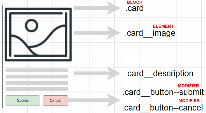
14. What is BEM (Block Element Modifier)?
BEM (Block, Element, Modifier) is a component-based approach to web development. It is based on the principle of dividing the interface into independent blocks. It allows for easy and fast development of interfaces of any complexity and reusing existing code, avoiding "Copy-Paste".
15. What is the difference between inline and block elements?
Elements in HTML are also divided into block and inline elements. Block elements are elements that serve as building blocks for web pages. They are used to separate the content of a web page into logical blocks, such as menus, headers, content blocks, footer, etc. Block elements are written on a new line; a line break is automatically added before and after these elements in the browser.
Block elements include <address>, <article>, <aside>, <blockquote>, <canvas>, <dd>, <div>, <dl>, <dt>, <fieldset>, <figcaption>, <figure>, <footer>, <form>, <h1>-<h6>, <header>, <hr>, <li>, <main>, <nav>, <noscript>, <ol>, <output>, <p>, <pre>, <section>, <table>, <tfoot>, <ul>, and <video>. All block elements have opening and closing tags.
Inline elements mark parts of the content within elements. They only occupy a limited space defined by the tags, and the browser does not automatically add line breaks.
Inline elements include <a>, <abbr>, <acronym>, <b>, <bdo>, <big>, <br>, <button>, <cite>, <code>, <dfn>, <em>, <i>, <img>, <input>, <kbd>, <label>, <map>, <object>, <q>, <samp>, <script>, <select>, <small>, <span>, <strong>, <sub>, <sup>, <textarea>, <time>, <tt>, and <var>.
16. What is the difference between margin and padding?
Margin - external margins.
Padding - internal margins.

17. What is the purpose of the overflow property and when should it be used?
The CSS property overflow determines whether the content of an overflowing block element should be clipped, provide scroll bars, or simply be displayed.
18. What are vh and vw units?
vh and vw are relative units and represent:
vh - 1% of the browser window's height.
vw - 1% of the browser window's width.
19. How to change the appearance of a cursor?
The CSS property cursor is used to change the appearance of the cursor.
.container {
    cursor: pointer;
}
20. How to change the flexbox container's axis direction?
The CSS property flex-direction is used to change the direction of the flexbox container axis.
21. What determines the size of an element?
The size of an element is constructed from the width and height of its content, inner padding, border, and outer margin.
22. How to position one element relative to another?
To control the positioning of a child element, set the position property to relative and use top/right/bottom/left to adjust its placement.
.element {
    position: relative;
    top: 20px;
    left: 20px;
}
23. What are the main properties of flexbox?
The main properties of flexbox are:
-
display:Specifies the element as a flex container. -
flex-direction:Specifies the direction of the flex items (row, row-reverse, column, column-reverse). -
flex-wrap:Specifies whether the flex items should wrap or not (nowrap, wrap, wrap-reverse). -
justify-content:Specifies how the flex items are aligned along the main axis (flex-start, flex-end, center, space-between, space-around). -
align-items:Specifies how the flex items are aligned along the cross axis (flex-start, flex-end, center, baseline, stretch). -
align-content:Specifies how multiple lines of flex items are aligned along the cross axis when there is extra space (flex-start, flex-end, center, space-between, space-around, stretch). -
flex-grow:Specifies how much a flex item can grow relative to other items. -
flex-shrink:Specifies how much a flex item can shrink relative to other items. -
flex-basis:Specifies the initial size of a flex item before any remaining space is distributed. -
order:Specifies the order in which the flex items appear within their container.
These properties allow for flexible and responsive layouts by dynamically adjusting the size and position of flex items within a container.
24. How to remove the bullet point from a list?
Set the list-style-type property to none for the corresponding list element. Here's an example:
ul {
  list-style-type: none;
}
25. What do you know about selector specificity?
Selector specificity determines the priority of selectors in a style sheet. The more specific a selector is, the higher its priority. Each selector has a weight:
Element selector - 1
Class selector - 10
ID selector - 100
Inline style - 1000
!important - has the highest weight.
26. Which CSS styles are most performance-heavy for browsers?
A large number of connected fonts, shadows, animations, and transparency.
27. What are pseudo-classes and which ones do you know?
Pseudo-classes describe characteristics of elements, such as dynamic states (e.g., a clicked link), language encoding (e.g., a paragraph in French), and more. They are not displayed in the source document and do not belong to the DOM tree. The most commonly used ones are :hover, :focus, :checked, :disabled, and others.
28. How to rotate a block by 90 degrees?
To rotate a block element by 90 degrees you can use the transform property along with the rotate function.
.block {
  transform: rotate(90deg);
}
This will rotate the block element clockwise by 90 degrees. You can adjust the angle by changing the value inside the rotate function.
Learn more
29. What pseudo-elements do you know?
A pseudo-element in CSS is a keyword added to a selector that allows styling a specific part of the selected element. For example, the pseudo-element ::first-line can be used to change the font of the first line of a paragraph.
The most commonly used pseudo-elements are: ::after, ::before, ::placeholder, ::first-letter.
p::first-line {
    color: blue;
    text-transform: uppercase;
}
30. What is !important and how do you feel about it?
!important declaration is used to give a style rule the highest priority, overriding any other rules that conflict with it. When applied to a CSS property, !important ensures that the specified value will be used, regardless of specificity or order of other rules.
!important use is generally discouraged due to some potential drawbacks:
Specificity issues: Using
!importantcan lead to specificity conflicts and make it difficult to maintain or override styles in the future.Difficulty in debugging: When multiple stylesheets or rules use
!important, it becomes harder to diagnose and troubleshoot styling issues.Inflexibility: It limits the flexibility and modularity of stylesheets, making it challenging to make changes or apply different styles to specific elements without modifying existing
!importantrules.Code readability and scalability: Overusing
!importantcan make the codebase less organized and harder to read, especially in larger projects.
In general, it's best to avoid using !important unless absolutely necessary, and instead utilize proper specificity and cascading principles to achieve desired styling effects.
31. What is the difference between <script>, <script async>, and <script defer>?
The browser loads and displays HTML gradually, especially noticeable with slow internet connections. The browser doesn't wait for the entire page to load before showing it; instead, it displays the portion that has been loaded.
If the browser encounters a <script> tag, it is typically required by the standard to execute it first before displaying the remaining page content. This means that the loading happens synchronously from top to bottom.
If the script is external, the browser won't display the content below it until the script has been executed.
When using the async and defer attributes, the browser starts loading scripts asynchronously, without delaying the display of HTML.
However, defer is used when the order of script execution is important. Scripts will be loaded synchronously but sequentially. Another difference is that defer will only execute after the entire HTML has been processed by the browser, whereas async starts loading immediately, even before the HTML finishes loading.
32. How to increase the size of an element on hover without shifting neighboring elements?
To increase the size of an element on hover without shifting neighboring elements, you can use transform property along with the scale function.
.element {
  transition: transform 0.3s ease;
}

.element:hover {
  transform: scale(1.2);
}
In this example, the transition property adds a smooth transition effect to the transformation. When hovering over the element, the transform: scale(1.2) rule scales the element by 20%, making it larger without affecting the layout or shifting neighboring elements.
By using transform: scale(), the element's size increases while maintaining its original position in the layout.
33. What are media queries?
Media queries are used in cases where different CSS styles need to be applied for different devices based on their display type (e.g., printer, monitor, or smartphone), as well as specific device characteristics (e.g., browser window width) or external environment conditions (e.g., ambient lighting). Given the vast number of internet-connected devices, media queries are a crucial tool for creating websites and applications that will function properly on all available devices used by your users.
@media screen and (max-width: 768px) {
  flex-direction: column;
}
34. For what data attributes are recommended to use?
Data attributes are recommended to use when you want to store custom data within HTML elements. They should be used when there is a need to attach additional information to an element that is not specifically represented by an existing HTML attribute.
Data attributes are prefixed with data- and can have any name following it. It is recommended to follow a naming convention that is descriptive, meaningful, and avoids potential conflicts with existing or future standard HTML attributes. For example, if you want to store information about a specific product on an e-commerce website, you can use a data attribute like data-product-id to store the unique identifier of the product.
By using data attributes, you can easily access and manipulate this custom data. It provides a way to enhance the functionality and behavior of your website or application without modifying the standard HTML attributes or structure.
<article
  id="some-article"
  data-columns="4"
  data-index-number="213124"
  data-parent="wrapper">
  …
</article>
35. How to create an infinite animation?
To create an infinite animation, you can use the animation property and set the value of animation-iteration-count to infinite.
.element {
  animation: myAnimation 2s infinite;
}

@keyframes myAnimation {
  /* Define the animation keyframes */
}
36. What is an attribute selector?
Attribute selectors select elements based on the presence of an attribute or its value.
a[href="https://example.org"] {
    color: green;
}

span[lang='en-US'] {
    color: blue;
}
37. How to change styles for a button with the disabled attribute?
To select an element with the attribute "disabled" set, you need to use attribute selectors.
button[disabled] {
  color: blue;
}
38. How to change styles for a <span> element that comes after an <input> element?
The adjacent selector is designed for this purpose. Adjacent elements on a web page are called "adjacent" when they immediately follow each other in the document's code.
input + span {
    color: blue;
}
39. Which selector can be used to apply a style to every element on a page?
Sometimes, it is necessary to apply the same style to all elements on a web page, such as setting the font or text formatting. In such cases, a universal selector can be used, which matches any element on the web page.
To denote the universal selector, the asterisk (*) symbol is used, and the syntax is as follows.
* {
    margin: 0;
    padding: 0;
    box-sizing: border-box;
}
40. What are CSS preprocessors, which ones do you know, and what are they used for?
A preprocessor is a program that takes input code written in a preprocessor language and outputs CSS that can be given to our browser. Preprocessors simplify the process of styling if you know how to use them.
There are several representatives of preprocessors, such as Sass / SCSS (.sass, .scss), Less (.less), and Stylus (.stylus). More often, preprocessors add new capabilities to CSS:
- Nesting
- Mixins
- Additional functions
- Modularity
- Variables
41. What are mixins in preprocessors?
A mixin is a function that takes arguments and applies rules dependent on these arguments to a given selector. Mixins allow you to create groups of CSS declarations that you will have to use multiple times on a website. You can even pass variables into mixins to make them more flexible.
Conclusion
Preparing for these CSS questions, studying the topics covered, and reviewing relevant resources can improve your chances of successfully passing the interview. This post is the second part of a series of post on interview questions. The next one will be about React interview questions that I have faced.
I look forward to your reactions and comments.
Good luck in your interview!


Top comments (0)