CSS is gaining powers with recent web evolution. And it is very clever with tricks that were long existing or that have emerged. Perhaps tricks shared here will school you with CSS tricks from the depths you were yet to explore.
Let's dive in.
-
Draw a triangle using border
It can be an overkill to load images in cases where you need simple triangles e.g when adding an arrow pointer to a tooltip.
Using only CSS, you can create a triangle using borders.
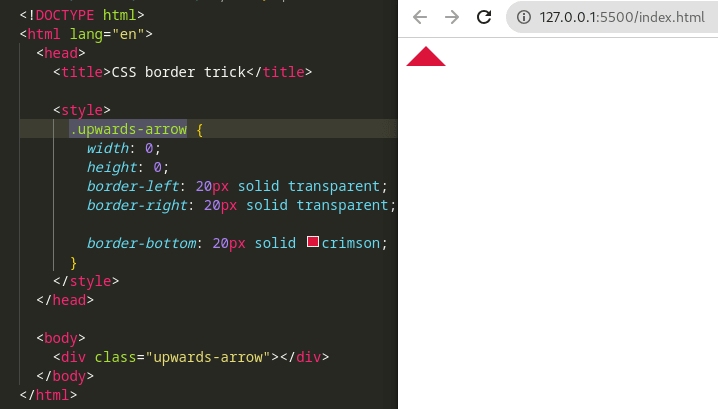
It is quite an old trick. Ideally, on an element with zero width and height, you set borders on it. All border colors are transparent except the one that will form an arrow. To create an arrow pointing upwards, for example, the bottom border is colored while the left and right are transparent. No need to include the top border. The border width determines size of the arrow:
.upwards-arrow {
    width: 0;
    height: 0;
    border-left: 20px solid transparent;
    border-right: 20px solid transparent;

    border-bottom: 20px solid crimson;
}
This creates an arrow pointing upwards like shown below:
You can see this codepen that visualizes the concept should it be tricky to create a mental picture.
-
Interchange background of an element
z-indexproperty arranges how an element is stacked onto other positioned elements. At times you may set az-indexproperty on a child element to be lower and it ends up hiding behind the background of its parent. To prevent this, you can cause a new stacking context on the parent element to prevent child elements from going behind it. One way way to create a stacking context is to useisolation: isolatecss style declaration.
We can use this stacking context technique to create hover effect that interchanges a button's background. For example:
button.join-now {
    cursor: pointer;
    border: none;
    outline: none;
    padding: 10px 15px;

    position: relative;
    background-color: #5dbea3;
    isolation: isolate; /* If ommitted, child pseudo element will be stacked behind */
}

button.join-now::before {
    content: "";
    position: absolute;
    background-color: #33b249;
    top: 0;
    left: 100%;
    right: 0;
    bottom: 0;
    transition: left 500ms ease-out;

    z-index: -1;
}

button.join-now:hover::before {
    left: 0;
}
The code above interchanges the background of the
buttonwhen hovered. The background changes without interfering with the text on the foreground, as seen in the gif below: -
Center an element
Probably, you already know how to center an element using
display: flex;anddisplay: grid;. Yet another unpopular way to center an element on the x axis is to usetext-alignCSS property. This property works out of the box when centering text. To also center other elements in the DOM, a child element needs to have a display ofinline. It could beinline-blockor any other inline...
div.parent { text-align: center; } div.child { display: inline-block; } -
Pill 💊 shape button
You can make buttons that are pill-shaped by setting the border-radius of a button to be a very high value. Certainly, the border-radius should be higher than the height of the button.
button.btn {
    border-radius: 80px; /* value higher than height of the button */
    padding: 20px 30px;
    background-color: #fdd835;
    border: none;
    color: black;
    font-size: 20px;
}
result:
Height of the button may increase with design changes. Hence you will often find it convenient to set
border-radiuswith a very high value so that your css keeps working regardless if the button grows. -
Easily add beautiful loading indicator to your website
As it is with developers, it is often a boring task to divert your focus to creating a beautiful loading indicator for your website. This focus is better utilized building other important parts of a project that deserve attention.
As you are reading, odds are high you also find this an annoying hurdle. That is why i took the time to take away this hurdle away from you and prepare nicely done loading indicators packaged in a library so you can "plug 'n play" from your dream project. It is a whole collection and you just need to pick the one that pulls the spark 💖 on you. Just see the simple usage of this library, with the source available on Github. Don't forget to leave a star ⭐.
-
Easy dark or light mode
You only require a few lines of CSS to enable a dark/light mode on your website. You just need to let browsers know that your website can display correctly in system dark/light mode:
html {
    color-scheme: light dark;
}
Note:
color-schemeproperty can be set on any DOM element other thanhtml.Then set variables that control background color and text color through your website, making it even more bullet proof by checking for browser support:
html {
    --bg-color: #ffffff;
    --txt-color: #000000;
}

@supports (background-color: Canvas) and (color: CanvasText) {
    :root {
        --bg-color: Canvas;
        --txt-color: CanvasText;
    }
}
Note: If you don't set
background-coloron an element, it will inherit the browser-defined system color for the dark/light theme matched. These system colors can be different between different browsers.Setting
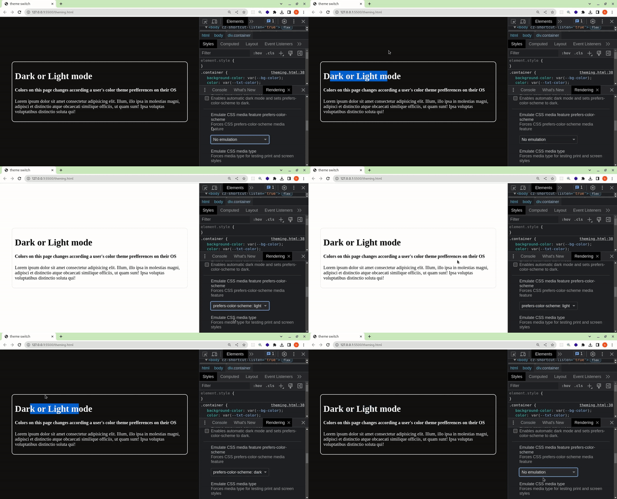
background-colorexplicitly can be useful in combination withprefers-color-schemeto give a different shade of color different from the default that the browser sets.Below is the dark/light mode in action. User's preference is simulated between dark and light mode.
Website reactive to system dark/light mode -
Truncate overflowing text with an ellipsis(
...)This trick has been around for a while to aesthetically trim long text. But you may still have missed it.
All you need is the following CSS:
p.intro {
    width: 300px;
    overflow: hidden;
    text-overflow: ellipsis;
    white-space: nowrap;
}
Just implement these rules:
- Explicit width, so bounds for clipping will ever be reached.
- Browser wraps below long text that do not fit within an element's width. So you need to prevent that:
white-space: nowrap;. - Content that overflows should be clipped:
overflow: hidden;. - Pad a string with an ellipsis(
...) when text is about to be clipped:text-overflow: ellipsis;.
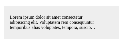
Result looks like this:
-
Truncate long text to a number of lines
This is slightly different from the trick above. This time, text is clipped limiting content to a number of lines.
p.intro {
    width: 300px;
    display: -webkit-box;
    -webkit-box-orient: vertical;
    -webkit-line-clamp: 3; /* Truncate when no. of lines exceed 3 */
    overflow: hidden;
}
Output looks like this:
-
Stop overworking yourself writing
top,right,bottom,leftWhen working with positioned elements, you often write code like this:
.some-element {
    position: absolute;
    top: 0;
    left: 0;
    right: 0;
    bottom: 0;
}
This can be simplified using an
insetpropety:
.some-element {
    position: absolute;
    inset: 0;
}
Or if you have different values for
top,right,bottomandleft, you can set them respectively in the order like:inset: -10px 0px -10px 0px. This shorthand works the same way as margin. -
Serve optimized images
Try throttling to a slow internet in the browser Dev tools and visit a website made up of HD images like unsplash. That's how to experience the pain of your website visitors trying to enjoy your high HD content from geographical areas with slow internet.
But you can provide a rescue especially with theimage-setCSS trick.You can give options to a browser to let it decide the most appropriate image that suits a user's device. For instance:
.banner {
    background-image: url("elephant.png"),
    background-image: -webkit-image-set(
        url("elephant.webp") type("image/webp") 1x,
        url("elephantHD.webp") type("image/webp") 2x,
        url("elephant.png") type("image/png") 1x,
        url("elephantHD.png") type("image/png") 2x
    );
}
The code above will set the background image of an element.
If-webkit-image-setis supported, then background image will be an optimized image, i.e an image of supported MIME type and that better suits the resolution power of the user's device.
For example: Since a higher quality image is directly proportional to a larger size, a user who has a high resolution device but in a poor network, will prompt the browser to decide on serving a supported image with lower resolution. Ii is logical not to make a user wait for the HD image to load.Note: An image that the browser decides as the best fit, is what is downloaded
-
Counters
You don't have to get stuck on how the browser renders a numbered list. You can implement your own design utilizing
counters(). Here's how:
ul {
    margin: 0;
    font-family: sans-serif;

    /* Define & Initialize Counter */
    counter-reset: list 0;
}

ul li {
    list-style: none;
}

ul li:before {
    padding: 5px;
    margin: 0 8px 5px 0px;
    display: inline-block;
    background: skyblue;
    border-radius: 50%;
    font-weight: 100;
    font-size: 0.75rem;

    /* Increment counter by 1 */
    counter-increment: list 1;
    /* Show incremented count padded with `.` */
    content: counter(list) ".";
}
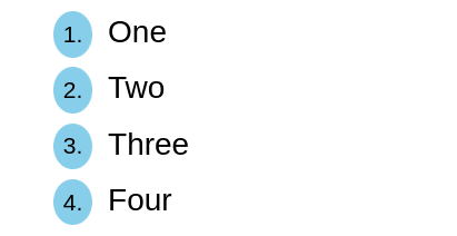
Output looks like this:
This works for any other DOM element apart from
<ul>and<ol>. -
Form validation visual cues
With only CSS, you can display helping visual cues to users regarding the validity of input entered in the forms. We can use
:validand:invalidCSS pseudo classes on form elements to apply appropriate styles when their contents validate successfully or not.Consider the following HTML page structure:
<!-- Regex in pattern attribute means input can accept `firstName Lastname` (whitespace sepearated names) --> <!-- And invalidates any other symbols like `*` --> <input type="text" pattern="([a-zA-Z0-9]\s?)+" placeholder="Enter full name" required /> <span></span><span>will be used to show validation results.And the CSS below styles an input regarding its validation result:
input + span {
    position: relative;
}

input + span::before {
    position: absolute;
    right: -20px;
    bottom: 0;
}

input:not(:placeholder-shown):invalid {
    border: 2px solid red;
}

input:not(:placeholder-shown):invalid + span::before {
    content: "✖";
    color: red;
}

input:not(:placeholder-shown):valid + span::before {
    content: "✓";
    color: green;
}
So we have achieved interactivity without consulting any javascript. A full codepen implementing this technique is shown below:
-
Select text with one click
This trick is inclined towards improving copy and paste experience for website users. Using
user-select: all, you can enable easy text selection with one click. All text node below that element is selected.On the other hand, you can disable text selection with
user-select: none;. Alternative way to disable text selection is placing text insidecontent: '';property of::beforeor::afterCSS pseudo element.
Thanks for reading. See you in the next article. Follow me here on Dev to be notified.
Also connect with me on twitter.


Top comments (20)
Great Article!! Lets keep it going 😂

We can use background-clip text to make text have a gradient:
Beware of cross-browser support though. If you want to support pretty much all browsers you can use svg instead to achieve the same effect:
Great technique,
The svg tactic is new to me and its a clever way for cross browser compat
Great, bookmarked, thanks for sharing.
welcome, also share the article to let others know
Thank you
You are always welcome
Awesome 👌
welcome again
Amazing content thanks
Welcome Jenap, follow for more useful content i emit
I appreciate you giving these kind hints.
Welcome mahmood, i believe you got smarter after reading the article
Loled at 3 :D
Sure that was an adrenaline rush you felt
Great Article! Thanks!!!
Thanks spirit,
Definitely you should follow me for more great articles
Some handy tips here - thanks for sharing.
Welcom, glad you found it useful
Brilliant…thank you for sharing..
Will definitely try them out
Welcome, I'm glad you found it useful